Lady Gaga- Judas (2011)
Lady Gaga is notorious for her strange and dramatic persona. She is known for not being worried about what people think about her personal and musical style. Judas in particular arguably crosses the line of acceptability as it plays with the idea of following Judas’ ways of betrayal instead of Jesus’ ways of kindness and innocence. This appeals to her target audience as they are mainly mainstream and therefore would find rebellion an exciting prospect, although not necessarily something they would partake in. The whole music video is made up of religious connotations towards good and evil using symbols, colours and costume.

The video opens up with a canted angle tracking shot of men on motorbikes driving down a motorway. Their costumes include a black leather jacket with a white skull and crossbones and the name of the wearer across the back. This is an intertexual reference, as demonstrated by Andrew Goodwin's music video conventions, to Marlon Brando who played a rebellious gang leader in
The Wild One. This immediately sets the video up as being about not conforming to everybody else’s beliefs and instead following your own.
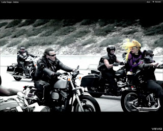
The song is about Gaga wanting to be a follower of Judas, therefore when she is with Jesus, it needs to be clear that they do not fit together. When Gaga is with Jesus and his followers, she is the only person wearing brightly coloured clothing. Everyone else is either in black, white or various shades of these colours. With this there are a lot of close up shots of Gaga stroking her face while looking directly into the camera; it is seductive and makes the audience want to keep watching her. Her make up in the close-ups add to this; it is bright and exaggerated. This sells the artist by making her desirable and over-feminine; the men fancy her and the woman want to be like her. A close-up of very long black and red fingernails wrapped around a man’s neck shows her control over the male which challenges the stereotype of women being the weaker gender; the black connoting power and the red connoting lust (and therefore sin). This enforces Gaga’s star persona of being highly made up and wearing extravagant clothing as she wants to be looked at.
The man Gaga is riding with is of ethnic origin and wears a crown of thorns on his head, connoting that he is the Jesus figure. He is wearing black bikers uniform and so informs the audience that he is a sign of revolution and making a change. The camera is looking straight on at Gaga and Jesus connoting an alliance of equal terms (something which changes later on due to Judas).
A high angled mid-shot shows Gaga walking towards the camera, swinging her hips very femininely. A high angle usually connotes a powerful dominance whereas the hip swinging immediately makes her seem overly female and therefore weaker; this juxtaposition emphasises that Gaga wants to appear controlling but needs to remind the audience that she still wants to be looked upon as very womanly. This representation of women conforms to the ideology of femininity is weaker than masculinity.
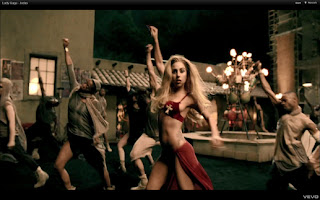
The camera zooms out quickly to a long shot of Gaga wearing a small red bikini outfit amongst modestly dressed dancers. The red is bright and stands out immediately in the grey buildings and low key lighting which adds to her persona of wanting the attention but also the colour red symbolises passion and lust and so this is clearly a form of male gaze, as demonstrated by Laura Mulvey's theory; as she stretches, her toned torso is emphasised making her body something to be desired. The connotations of the colour red can also be linked to the narrative of the video being about sinful temptation. In amongst the shots of her dancing, there are quick cuts to a tight, high angled close-up of Gaga touching her face seductively. She wears bright red lipstick with a single transparent jewel on her right cheekbone. This could take the place of a beauty spot, representing her as being innocent and young which targets Gaga's audience of teenage girls.
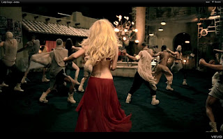
One of Goodwin's theories is that of synaesthesia which is used in the video, more obviously during the dance routines that are common in mainstream pop videos. In one shot, Gaga is turned around and shaking her hips side to side to the music. She is directly in the centre of the frame where the eyes are drawn to immediately and once again she is wearing a red bikini outfit which attracts the attention. Her long blonde hair contrasts the red outfit making the image pretty and girly; this sense of innocence comes from the fact that we cannot see her more feminine features such as her stomach and breasts. Another example of synaesthesia is during the lyrics “bring him down” where Gaga throws her head and hands down when it is sung. It is with an angry force that she does this, bringing her emotions through; this connotes her passion for rebellion and believing that bringing down the powers of
Jesus is the right thing to do. This is therefore also an example of amplification, another of Goodwin's theories, as she is not actually acting out the lyric but is amplifying it.
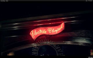
An interesting shot is of a neon light reading ‘Electric Chapel’. More obviously, a chapel is a place of worship and therefore is another religious reference but it is also the name of a song off her third album which was released
after ‘Judas’ was released in the charts. This reference was therefore for the die-hard Gaga fans to look back on when they had brought the album. This creates an intimate relationship between Gaga and her fans and therefore keeps them interested in her and her work.
One of Goodwin's theories is that of the music video distinguishing between the verses and the chorus, and this is demonstrated here. The editing of the verses is very choppy with many different shots of Gaga and so different costumes and settings. The chorus however is mainly just one long take of Gaga dancing with her backing dancers. The setting is in a marketplace which is an intertexual reference, as demonstrated by Goodwin's theory, to the story in the bible where Jesus gets angry at people turning his Father’s home into a marketplace. The setting is therefore important because it is a place of sin both in the bible and in Gaga’s video. She is wearing all black and so are the dancers, therefore she is standing out less. This is because in this fragmented narrative, she has now joined Judas and his followers. The chorus consists mainly of high angle shots of Gaga with the dancers with a few bust shots of Gaga, keeping the intimacy between Gaga and the audience.


Later on in the video, after a fighting scene with
Jesus’ followers and
Judas’ followers, Gaga breaks up the two leaders before aiming a gold gun at
Judas’ head, fooling the audience into thinking that maybe Gaga has chosen
Jesus, however after a moment the gun turns into a lipstick, emasculating what would otherwise be seen as a dangerous object. The lipstick sells the video to the audience who are predominantly female teenagers. This scene portrays
Judas as a fool and therefore not the right path to choose which goes against the previous messages and values of the video which is to be rebellious. What must not be forgotten is that this is a mainstream pop video which needs to sell to its audience of unpretentious female teenagers; the video therefore needs to be tied up by showing dominant ideologies, in this case Gaga choosing the treacherous Judas as having consequences.
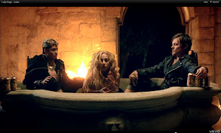
The music video then changes as the non-diegetic music turns into diegetic music with cuts between 3 different scenes. The first is of Gaga in a bath tub with
Jesus and
Judas by her side. She is splashing water over her half naked body very seductively. However there are no close-ups of fragmented shots of her body and so the audience is not being invited to completely look at her in a male gaze, which challenges Laura Mulvey's theory of music videos being primarily about looking at women sexually. Instead the scene is important to establish the binary opposites of good and evil with Gaga in the middle because she is being torn between the two. The costumes are black and there us fire in the background where there is a stone wall making the setting feel very medieval. This suggests that Gaga is leaning towards
Judas in the narrative.
The second scene is long shots of Gaga wearing a gold mermaid-like outfit with large waves crashing behind and around her. The water represents changing states and could emphasise the binary opposition of good and evil with Gaga’s mind changing between the two. She is eventually consumed by the water which shows the ultimate power of nature.
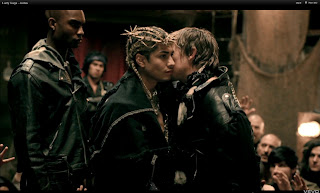
The final scene is of
Jesus being welcomed by a screaming crowd of people into a room.
Judas, with the lipstick still on his face, welcomes him into the room with kisses to the cheek. This is another religious reference to The Last Supper where
Judas betrays
Jesus. It is evident that the audience are being positioned to empathise with
Jesus as not only is he shown to be the popular character but he is the one about to be betrayed; the audience would be the type of people who abide with the rules and so would not agree with this. There are not as many shots of this scene though as Gaga features very little in them.
All of these shots are quickly cut together into a 34 second sequence which puts focus on the narrative as opposed to the actual song. This illustrative scene, which is one of Goodwin's music video conventions, emphasises the importance of what the lyrics are talking about; the story of Jesus and Judas.


